My Groceries
To view the low-fidelity prototype, click here.
Note: This is a student project completed during the Thinkful UX/UI Intensive program.
Roles
Research design
Information architecture
UX design
Project: Conceptual product for multi-store shopping lists
Duration: 3 weeks (January 25, 2021-February 8, 2021)
Problem
Many iOS users simply make their lists in Notes because it's already pre-loaded on their devices. Notes works well enough, but it's clearly not meant to act as a grocery list app. When they do try other third-party apps, many of them are overwhelmed by the number of extra features, unsatisfied with the user experience, or pushed away by the unappealing visuals.
Audience
Below is a breakdown of my target audience based on data from the user survey I conducted.
Summary
The multi-store shopping app will be an iOS application that serves the needs of users that make their lists in the native Notes app. Contrary to Notes, this product will allow users to easily create, edit, and organize lists by store, as well as creating categories within which to sort their list items.
Solution
I created this multi-list shopping app, which is essentially a "remix" on Notes' structure with additional features inspired by other existing mobile products. The app enables users to create and edit the details of store lists, individual list items, and item categories.
Process
I aligned the User Centered Design framework of Empathize, Define, Ideate, Prototype, and Test with the extended the 5-day design sprint (Identify target, Sketch, Decide, Prototype, and Test). I followed this process in order to stay mindful of what work needed to be completed at each stage, as this project was more self-directed than the Bus App intensive.
Client interview
My client had an existing concept for a grocery list app, so I interviewed them in order to gain insight into how the solution could benefit as many users as possible. We identified the opportunity to create a multi-store grocery list app that is simple and intuitive like Notes and has extra functions that improve the grocery list-making and -organizing experience.
Following the interview, I created a brief document outlining the business, user, and functional requirements for the solution we wanted to create together.
To view the business requirements doc, click here.
User research
To further empathize with the user, I also created a survey. I wanted to gather generative research data regarding target users' grocery shopping and list-making habits.
Some of the key stats from my survey were:
To view the survey I distributed, click here.
I synthesized my client's insights and the survey findings into three deliverables that humanize the problem that we wanted to solve.
My persona, Carla, acted as a composite of the data representing our target audience for this product. With her, I was able to develop our product with a hypothetical person with which to measure it against.
I created an empathy map in order to further understand Carla's general attitude about this particular problem.
I also created this current-state journey map in order to identify the potential pain points that Carla experiences during a typical trip.
Information architecture
After creating user stories, I developed and iterated upon a series of user flows and a site map focused on creating new lists, list items, and categories. This step helped me define which features to offer and how to implement them within the app.
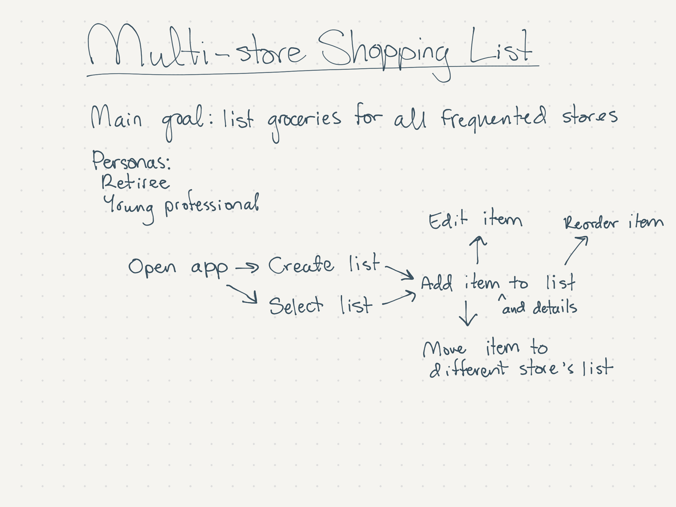
Below is the initial sketch I made in order to map out the most essential actions a user would take, both new to and familiar with the app.
Here are the updated new and existing user flows. The differentiation between "new" and "existing" users is that "existing" users have at least one list with at least one item, while "new" users have neither and must take the "Create a New List" action.
Below is the most up to date site map.
To view the final list of user stories, click here.
From sketched ideas to low-fidelity wireframes
I started ideating upon the visual structure through sketches first in order to rapidly generate and iterate upon my ideas. It made the most sense to choose a mobile-friendly design as my users reported that they use Notes on their iPhones.
I looked to other existing products in order to borrow accessible patterns and features for my own design. Below are the features and patterns I borrowed and their sources.
I utilized the Crazy 8s method to rapidly ideate and iterate upon the screens' overall layouts. Below, I created seven different screen layouts and one iteration upon the Store List layout.
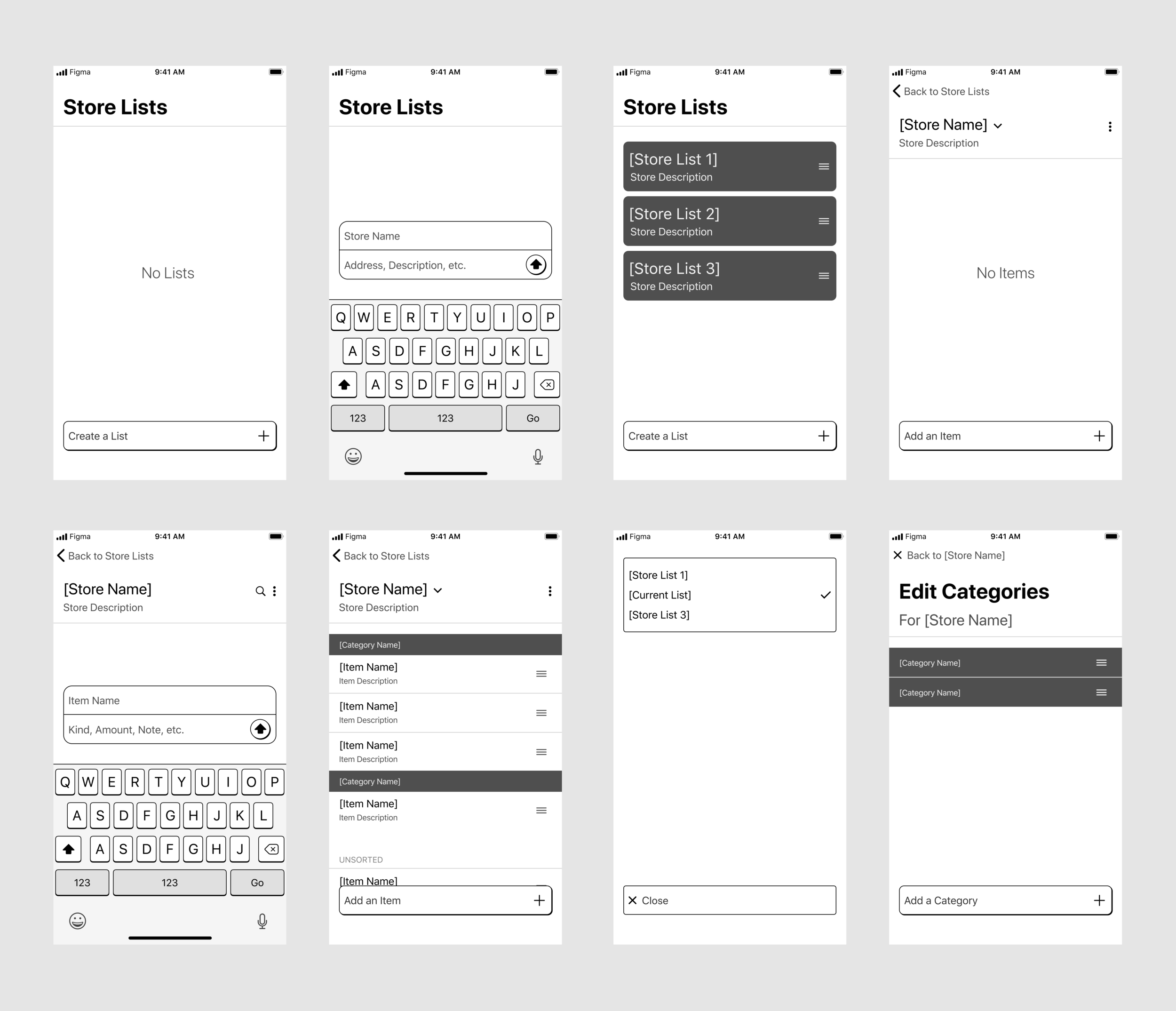
The Crazy 8s exercise helped me settle on preliminary layout choices for my wireframes. I was ready to take them from sketches to digital, low-fidelity designs.
Prototyping
I based my paper prototype on the wireframes. I added extra screens to mimic progressive interactions that would occur in the digital prototype. This paper prototype allowed me to rapidly test the design's layout, content structure, and accessibility without sinking too much time into digital prototyping up-front.
The paper prototype was ready to digitize following a couple of rounds of rapid testing.
To view the low-fidelity prototype pre-testing, click here.
Usability testing
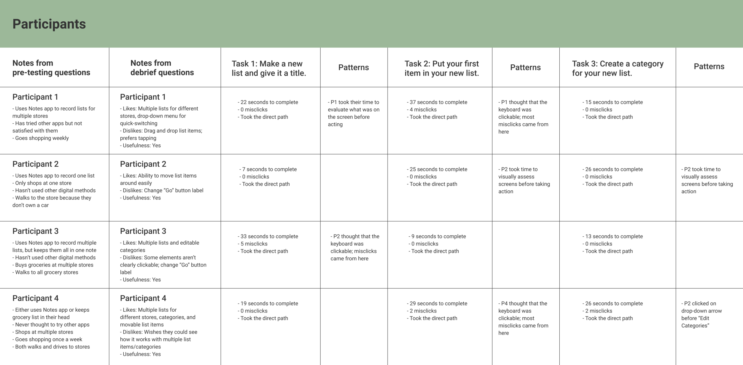
I gathered feedback on my low-fidelity wireframes from potential users by giving them a task to complete within the clickable prototype and looked out for signs of difficulty or confusion along the way. In the tables below are the key responses to interview questions and metrics that indicate the usability of a particular feature.
The tests were successful overall, but I needed to make slight changes to micro-interactions and icons.
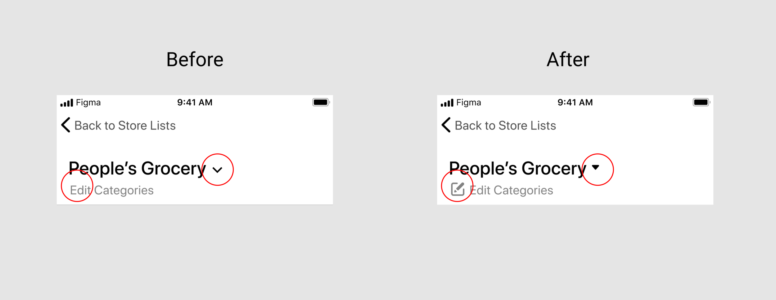
I replaced the chevron (down arrow) with a rounded arrow in order to more clearly indicate that tapping the icon opens the quick-switch menu. I also added an icon next to the "Edit Categories" because some users did not realize that the text was clickable before.
Users also mentioned that the "Go" microcopy wasn't as clear as "Enter" is, so I changed that as well.
To view the most updated version of the low-fidelity prototype, click here.
Next Steps
This design is currently in a low-fidelity state, so the next logical step would be to begin visual development and branding. I will continue to work with my client on a color palette, logo, and finalizing the visual design for a high fidelity prototype.
During visual development, I intend to contact users for A/B testing of our visual deliverables. This way, we can determine which visual direction to go in based on what our users need.
Conclusions
This project was a test in exploring possible solution paths while aligning with my client's project guidelines. I feel that I succeeded at designing the minimum viable product's low-fidelity prototype with these guidelines in mind at all stages, thanks to the precise focus of my client's problem statement. I look forward to further developing this product with the help of my client and our target users.
Thank you for reading!
Click here to go back to the homepage.


